The ultimate guide to designing HAF and SEND programme materials that actually get families to book
You've planned brilliant activities for your HAF or SEND programme. You've sorted venues, staff, food - everything. But are your sessions actually full? If you're struggling with empty spaces and last-minute bookings, the problem probably isn't your activities. It’s how parents discover them and how easy they are to book.
Why Good Design Matters
Every year, councils invest millions in HAF and SEND programmes. But many eligible families still don't take part — not because they're not interested, but because they don't know what's available or don't know how to book.
When your posters and social posts don't work, you end up with:
- Empty places that could have helped families
- Stressed last-minute bookings
- Endless phone calls from confused parents
- Programmes that look "underused" (even though they're great)
Good design removes the barriers between families and your programme.
What We've Learned
At Eequ, we run a booking platform for HAF and SEND programmes and for private clubs and classes. We work with councils across England and watched thousands of families search and book activities. Here's what actually happens:
Parents scan, they don't read: Research by Nielsen Norman Group found that 79% of people scan rather than reading word-by-word. That means you've got seconds to communicate what you're offering — big blocks of text simply don't work.
Reading is hard for many families: About 1 in 6 adults in England struggle with reading. If your poster needs careful reading to understand it, you're losing the families who need you most.
Parents are busy: They're working, juggling childcare, managing complex lives. If booking looks complicated, they'll just give up.
Everyone's on their phone: Most parents will see your poster as a quick photo on their phone. Does it still work at that size?
What This Guide Covers
This isn't about fancy design software, finding a good graphic designer or even expensive agencies. It's about understanding what actually gets families to book.
We'll cover:
- Understanding Your Customers: Who you're really designing for
- Visual Hierarchy: Making important info impossible to miss
- Accessibility: So everyone can read your materials
- Typography: Fonts and text that actually work
- Images: Using photos to communicate faster
- Calls to Action: Making it obvious what to do next
- Consistency: Keeping everything working together
- Common Mistakes: What doesn't work (so you can avoid it)
By the end of this guide, you'll know how to design materials that fill sessions, reduce admin pressure, and reach the families your programme is meant for.
Let's start!
Understanding your customers

Who Actually Books HAF and SEND Activities?
You're designing for busy parents and carers who need to make quick booking decisions. Here's what actually matters to them:
Mobile-first users: Over 80% of bookings on Eequ happen on phones. Parents book during school runs, lunch breaks, late at night or whilst managing other tasks. They need to see key information immediately — no scrolling, no searching.
Time-poor families: They're comparing multiple activities quickly. Your design needs to show what matters most at a glance:
- Activity name
- Dates, age range
- Available spaces
Use consistent layouts so families can scan and compare easily.
Mixed literacy levels and digital confidence: Not everyone's comfortable online. Use simple language instead of jargon — say "activity" not "provision", "location" not "setting". Add icons alongside text to help understanding, but don't rely on icons alone.
SEND families (Special educational needs and disabilities): These families need clear information about accessibility, sensory environments, and staff support. Make this easy to find — use a dedicated section with a clear label, not buried in descriptions.
The Mobile Phone Reality
Mobile bookings dominate HAF programmes. Here's what this means for your designs:
Images: Use vertical images (3:4 ratio works well, this is a typical mobile photo size). Landscape images are scaled to a screens width and lose impact as your information becomes illegible.
Text size: Never go below 16px for body text. Smaller text forces users to zoom, which breaks their flow.
Touch targets
Buttons and links need to be at least 44×44px. Smaller targets cause mis-taps and frustration. If using a social app, this should be covered as they'll provide what you need!
Layout: Stick to single-column layouts. Keep it simple. Put the most important information at the top — what, when, where, and the booking button.
Quick decisions: Users want instant answers. Design your content to flow logically:
- What's the activity?
- When does it run?
- Are there spaces?
- How do I book?
Answer these questions in order, and you'll remove friction from the booking journey. Use expandable sections for extra details like directions or cancellation policies — available when needed, but not cluttering the main view.
Visual Hierarchy
Adding structure, space and wee chosen fonts make all the difference between a good and bad design.
Making Sure Parents See What Matters
Think of your poster, flyer, email or social post like a conversation. You wouldn't tell someone your life story before asking them to do something — same principle here.
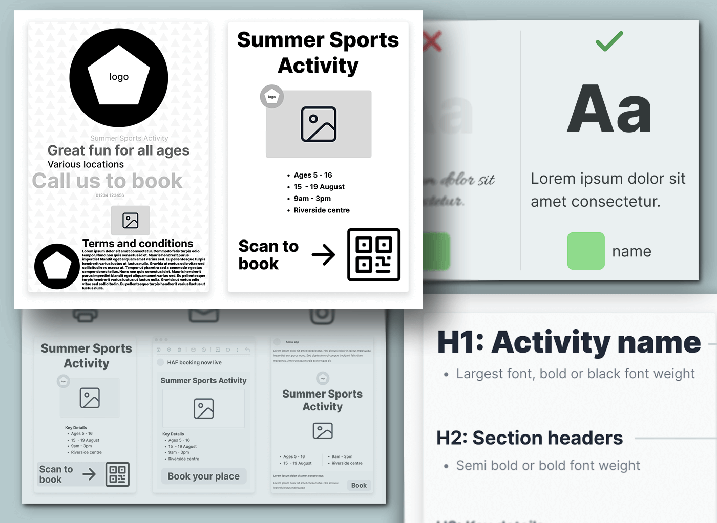
The graphic above demonstrates the difference between bad and good hierarchy. The left one puts the provider logo front and centre — but parents don't care who's running it until they know what it is. The right poster gets it right: the activity name grabs attention first, followed by the specific information parents need to make a decision.
What Parents Need to Understand in 3 Seconds
When a parent glances at your material, they need to instantly understand:
- What it is: Free holiday activities and meals
- Who it's for: Ages/year groups (especially important for SEND provision)
- How to book: The action they need to take
Everything else is extra detail they can read if interested.
Make It Bigger = Make It More Important
The biggest thing should be your main message
- Good: "Free February Half Term Activities & Hot Meals"
- Bad: "Local Authority HAF Programme Information"
The second biggest thing: key details
- Ages 5–16 (or specific SEND provision)
- Dates and times
- Location
The third biggest thing: how to book
- Make this stand out with a different colour
- "Book Now" or "Call 01234 1234567 to Book"
- Give it space - don't squash it next to other text
The smallest text: nice-to-know stuff
- Activity descriptions
- Provider information
- Logos
Three Simple Rules
1. Use space: Don't cram everything in. Empty space helps parents focus on what's important.
2. One colour for action: Pick one bright colour just for your booking button/details. Don't use it anywhere else.
3. If in doubt, make it bigger: Parents often skim these materials whilst juggling children. Make it easy for them.
Common Mistakes…and Fixes:
- Everything is the same size → Make important things noticeably bigger ✔️
- Booking details hidden in a paragraph → Put booking info in its own box with space around it ✔️
- Lots of different colours and fonts → Stick to 2 fonts and 3 colours maximum ✔️
Remember: Your goal isn't to win design awards. It's to get families booked onto your HAF programme.
Accessibility isn't optional
What is accessibility?
Accessibility means everyone can read and understand your materials — whether they wear glasses, are colour blind, have dyslexia, or find reading difficult.
Many children in HAF programmes have SEND. If your poster has tiny text or poor colour contrast, you're locking out families who need you most.
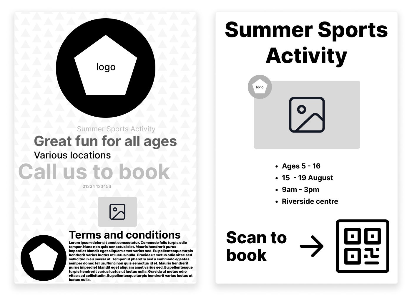
Look at the difference contrast and font choice make in the image above. The left example might look 'prettier' with its decorative script, but a parent squinting at their phone in bright sunlight can't read it. The dyslexic parent struggles with the swirly letters. The colour-blind parent doesn't know what that green square means.
The good news? Accessible design is just clearer design. Everyone benefits.
The Basics
Colour Contrast:
- Text must stand out from its background
- Check it with the free online accessibility tools like WebAIM Contrast Checker
- Grey text on white? Usually fails this test
Text Size:
- Minimum 12pt for printed materials
- 16px for web
- Use clear fonts, not fancy decorative ones
- Keep sentences short
Don't Use Colour Alone:
- Don't rely only on colour to show important information, e.g. colour-blind users won't be able to tell the difference between red and green
- Add icons, labels, or patterns alongside colour
Plain English:
- Write like you're explaining it to an 11-year-old
- Break up text with headings and bullet points
- Avoid jargon and acronyms — be concise
Quick Check
Before publishing, ask yourself:
- Can I read this easily on my phone in bright sunlight?
- Does it make sense in black and white?
- Could I book in under 30 seconds?
When your design is clear and simple, you remove barriers for everyone, not just families with disabilities.
Typography That Works
Typography is Simply the Art of Arranging Text
Choosing fonts, sizes, spacing, and layout to make words easy to read and understand. It's not about fancy lettering or decorative flourishes; it's about ensuring that when someone looks at your leaflet, poster, or social media post, they can quickly and comfortably read what you've written.
Good typography isn't about making things look fancy, it's about making sure everyone can actually read your content. Whether you're creating materials for HAF (Holiday Activities and Food) programmes or SEND support resources, your font choices directly impact whether families can access the information they need.
Font Selection
For digital materials (websites, emails, social media):
- Use sans-serif fonts like Arial, Helvetica, or Verdana — they're clearer on screens
- Test on both phones and computers to ensure readability
- Try free options from Google Fonts (Open Sans, Lato, or Roboto work brilliantly)
For printed materials:
- You've got more flexibility, but readability still comes first
- Test your chosen font at different sizes before committing
- Check it prints clearly — what looks good on screen doesn't always translate to paper
- Pin your design to a wall and step back a few paces — can the largest fonts be read clearly?
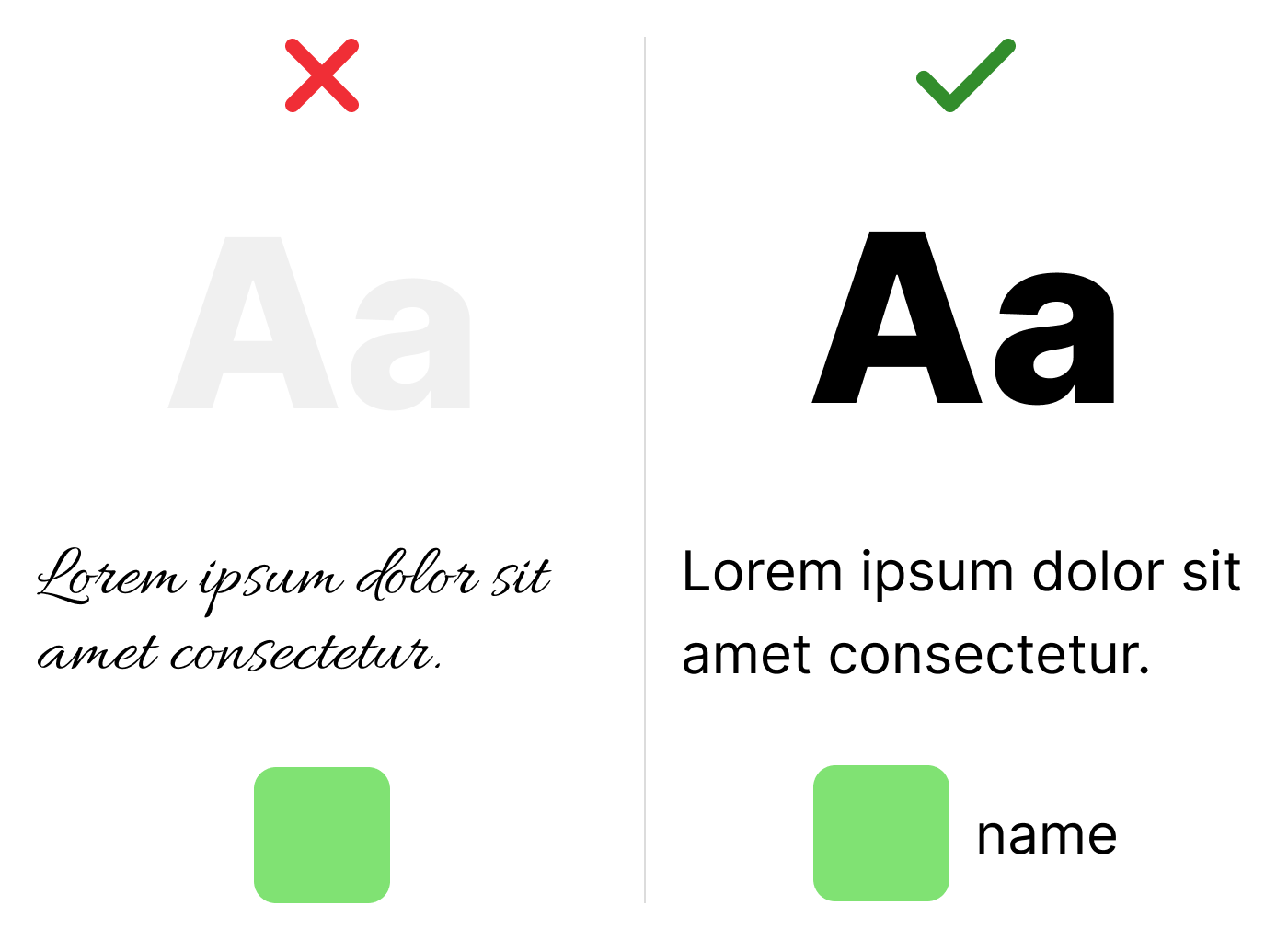
Text Hierarchy
Think of your text sizes like a family: headlines are the parents (biggest), subheadings are the teenagers (medium), and body text is the children (smallest but still important).
A typical scale might be:
- 32pt for main titles
- 24pt for subheadings
- 16pt for regular body text
Other hierarchy rules:
- Use bold sparingly — only when something is genuinely important
- Set line spacing to 1.5 for comfortable reading
- Avoid writing whole sentences in CAPITALS — they're harder to read and can feel like shouting
The Readability Factor
People scan websites and leaflets; they don't read every word. Make their lives easier:
Writing tips:
- Keep sentences short and punchy
- Break information into bullet points when you've got a list
- Limit paragraphs to 3–4 sentences maximum
- Put the most important information first
Remember: If a parent is juggling children whilst trying to find out about your HAF activities or SEND provisions, they need to find information fast. Your typography should help, not hinder.
Imagery and Visual Content
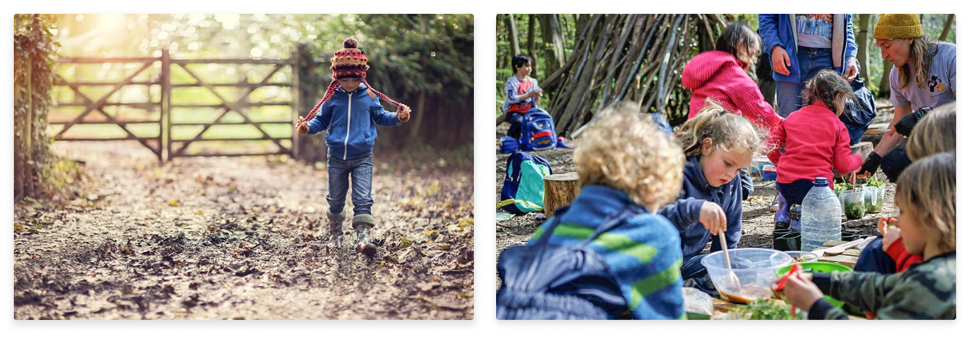
The Image Problem
Many programmes fall into the trap of generic stock photography — those overly posed, artificially lit shots that make every organisation look identical. Whilst these images feel "safe," they fail to convey authenticity or connect with your audience emotionally. Add safeguarding requirements into the mix (particularly when working with young people), and the challenge intensifies.
The solution isn't avoiding real imagery altogether, but rather finding creative approaches that protect privacy whilst maintaining authenticity. Consider using shots that don't show faces directly, environmental photography that captures atmosphere, or illustrations that represent real experiences without identifying individuals.
Image Best Practices
Prioritise action shots over posed photography. Images of people actively engaged in activities — whether learning, playing, or collaborating — tell a stronger story than staged portraits.
Diverse representation isn't just a checkbox exercise; it should authentically reflect your programme's participants and values. When selecting images, ensure they show various ages, ethnicities, abilities, and backgrounds in meaningful, non-tokenistic ways.
Image quality matters significantly for credibility. Always use high-resolution images (minimum 1920px width for hero images, 800px for smaller placements) — this shouldn't be an problem as modern mobile phones have excellent cameras that save images at high resolution.
Original photography from your actual programmes creates the most authentic connection, but if needed, source from image stock libraries like Shutterstock or Unsplash.
Icons and Visual Elements
Icons excel at conveying information quickly — use them for bullet point information like:
- Age ranges
- Activity type
- Accessibility features
- Location
However, maintain consistency throughout your design by selecting a single icon style (outline, filled, or duotone) and sticking with it. Avoid the common pitfall of overloading designs with too many visual elements. Each icon should serve a clear purpose; decorative elements without function create visual noise that undermines your message.
Consistency Across Touchpoints
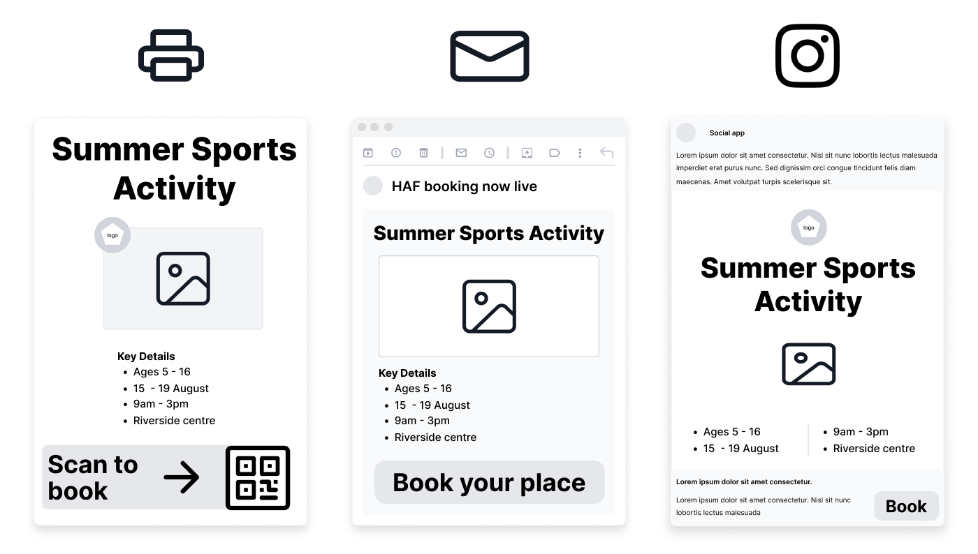
When families interact with HAF and SEND services, they'll encounter multiple touchpoints — different places where they connect with your programme. These might include your website, printed flyers, emails, phone calls, social media posts, or in-person registration desks. Each of these is an opportunity to build trust and make things easier for families.
Consistency across all these touchpoints means families get the same clear, reliable experience wherever they interact with you. This is particularly important because:
Why consistency matters:
Builds trust
When everything looks and sounds familiar, families feel confident they're in the right place
Reduces confusion: Parents don't have to relearn how things work each time they interact with you
Saves time: Families can quickly find what they need without second-guessing
Creates accessibility: Consistent layouts and language help everyone, especially families with SEND children who benefit from predictable structures
What to keep consistent:
Visual identity: Use the same colours, logos, and fonts everywhere
Language and tone: Write in the same friendly, simple way across all materials
Information structure: Put similar information in the same places (e.g., contact details always at the bottom)
Key messages: Repeat important information like "free meals included" or "SEND support available"
Processes: Keep registration steps, booking systems, and enquiry methods similar across channels
Practical example If your website says to "book online or call us," make sure your flyers say the same thing. If your email uses simple bullet points to explain what activities are available, your posters should follow the same format. This joined-up approach helps families navigate your services with confidence, reducing barriers to participation for both HAF and SEND programmes.
Common Mistakes to Avoid
When designing for HAF and SEND provision, even well-intentioned choices can create barriers. Here are the most common mistakes to watch out for:
Visual Design Errors:
- Using busy backgrounds or patterns that make text difficult to read
- Creating colour combinations with poor contrast (especially light text on light backgrounds)
- Making font sizes too small — aim for a minimum body text size of 16pt (web) and 12pt (print)
- Overlaying text directly onto photographs without adding a solid background or shadow
Content and Layout Issues:
- Cramming too much information onto one page or poster
- Using jargon or complicated language without explanations
- Forgetting to include essential information like dates, times, and contact details clearly
- Placing important information at the bottom where it might be missed
Web Accessibility Oversights:
- Not providing information in alternative formats (such as Easy Read or large print)
- Using icons or symbols without text labels
- Creating digital content that screen readers can't interpret properly
- This assumes families have access to smartphones or computers, but we know not all do, this is where printed material helps.
Print Accessibility Oversights
Using glossy paper. Shiny paper creates glare making it hard to read. Use matte white paper with solid backgrounds.
Fancy fonts and capital letters are difficult to read, especially for people with dyslexia. Use clear, simple fonts in sentence case.
Poor contrast and colour choices. Coloured paper or light grey text reduces readability. Black text on white paper provides the best contrast and is often cheaper to print.
Tip: sometimes the best printed materials for HAF and SEND families are often the simplest. Clear, well-structured black text on white paper will usually outperform a beautifully designed but hard-to-read alternative.
Communication Mistakes:
- Only sharing information through one channel (e.g., only online or only on paper)
- Using language that feels exclusionary or assumes prior knowledge of HAF programmes and activities
- Not considering that English might be an additional language for some families
- Failing to show diverse representation in images and examples
The key is to test your designs with actual families before finalising them. Ask parents and carers — particularly those with SEND children — if they find your materials clear and welcoming. Often, what seems obvious to designers isn't obvious to everyone else.
Conclusion: Design as a Booking Tool
Good design isn't just about making things look nice — it's about making bookings easier and faster for families accessing HAF and SEND services.
Why Design Matters for Bookings
When parents and carers need to book activities or support, they want a simple process that works. The right design helps by:
Removing barriers:
- Clear buttons that tell you exactly what to do next
- Simple forms that only ask for essential information
- Language everyone can understand–no jargon
Building trust:
- Showing families exactly what they're booking
- Being upfront about costs, times, and what's included
- Confirming bookings immediately with clear details
- Making it easy to change or cancel if needed
Working for everyone:
- Functions properly on phones, tablets, and computers
- Accessible for parents with disabilities
- Easy to use for people who aren't confident with technology
- Available in different languages where needed
The Bottom Line
For HAF and SEND services, your booking system is often the first interaction families have with you. If it's confusing or complicated, people give up. If it's clear and straightforward, they complete their booking and feel confident about attending.
Good design means:
- Fewer abandoned bookings
- Less time spent supporting confused families
- More children accessing the activities they need
- Better experience for everyone involved
When design works well, people don't notice it — they just successfully book what they need without frustration.
Ready to Put This Into Practice?
Designing effective programme materials takes time and expertise. At Eequ, we offer a poster design service specifically for our providers — whether you're promoting HAF programmes, SEND provision, or private activities.
If you'd like a professionally designed poster that follows these principles and actually converts families into bookings, send us a support message. We'll get right back to you with examples and next steps.